
|
|||||||
|
What if a floated element is wider than its containing block?
Although the current CSS float specification provides an excellent floats model, it suffers from flaws of expression, namely:
These problems mean that the specification is likely to be poorly understood, a concern evinced by the state of support in all browsers released to date - I feel that part of the reason for the low quality of most implementations to date is that people have not understood what the specification is saying.
Moreover, I feel that this section of the specification's difficult nature has led to a very poor understanding of floats among page authors, with the number of people who truly understand it numbering only a handful; for example, an erroneous float example was cited on the CIWAS newsgroup, which is generally populated by people who have a better understanding of CSS than most, and no-one pointed out that it was incorrect. This I believe demonstrates the need for a clearer spec on floats.
As a result, I have produced this document. It is essentially a restatement of the current position, removing errors and ambiguities, and although it does include some changes (clearly noted as such), it is principally a restatement.
Floats are used to create the appearance of elements flowing around one another. They can be used in three main ways:
The basic principle of floats is that they are withdrawn from the normal flow of the document, and do not affect the position of subsequent block elements. However, inline elements, including line boxes, do take the position of floats into account - they flow around them.
As a result, although floats overlap with block elements, they do not overlap with their inline content - it is displaced to one side. In addition, although block elements do not take into account previous floats, floats themselves do take into account previous block elements, as well as the horizontal (but not vertical position) of previous floats.
In addition, floats are moved as far to the left (if float:
left) or right (if float: right) as possible;
and when floats were originally inline, they are aligned with the top of the
line box from which they were displaced.
In a nutshell floats can be summarized thus:
Here are some examples of the main effects and the code used to achieve it:
DIV.column1 {float: left;
width: 50%}
DIV.column2 {float: left;
width: 50%}
<DIV class="column1">
<a href="#">MP3</a>
<a href="#">CDs</a>
<a href="#">DVD</a>
</DIV>
<DIV class="column2">
<a href="#">Account details</a>
<a href="#">Shopping basket</a>
</DIV>
<P>
<SPAN style="float: left; font-size: 3em; line-height: 3em">T</span>he
newspaper article with a dropcap.
</P>

It is generally the rule that later elements in CSS overlap earlier ones. Floats are one of the two exceptions to this general rule (the other being elements with z-index). Floats are always rendered on top of block elements. Since inline content is displaced to the side of floats, it is rarely the case that it will overlap with block elements; however, when it does (e.g., because of a negative margin), it will be rendered on top of the float.
The importance of this is that it means that the backgrounds and borders of elements that overlap with floats (as will happen when a float is followed by a non-floating block element) will be rendered behind them.
Block-level non-replaced floats
(e.g., P, DIV, etc.) must be assigned an explicit width, since
otherwise the float could equally well be rendered as
width: 100%, width: 50%, etc.
This requirement does not apply to inline-level non-replaced [1] or replaced elements, since in the former case
the width of the content provides the width of the element, and
in the latter case if width is omitted, its value is
determined by the intrinsic value for the element.
Those wishing to extend the width of floating inline-level non-replaced elements (as in:
<P>
<SPAN style="float: left; width: 3em; line-height: 5em; font-size:
6em">A</SPAN> drop cap
</P>
) should note that although width is not valid on inline boxes, it is valid on inline-level block boxes (i.e., floated inline-level elements) (since they are then, as with all floats, block boxes), but its use is not recommended, since there is no way of determining the width of a glyph without access to detailed information about the font. For example, width: 1em might look sensible given 'm', but less so given 'i'. As a result, you are advised to rely on width: auto, which would assign to the element the width that is appropriate, and then add or remove space using negative or positive padding and margins.
Note that unless the inline-level float is assigned a width, it will never wrap onto another line, so for floats that contain a lot of content, it is recommended that a width is assigned, which will cause the element to wrap at 'width'.
If an element is flowing next to another float, and will overflow its containing block, it will be moved below that float and then rendered there.
For example:
<DIV style="float: left; width: 50%">
<DIV style="float: left; width: 60%">
This would result in the second DIV being moved below the first because it would otherwise overflow the containing block.
Equally:
<DIV style="float: left; width: 50%">
<DIV style="float: left; width: 110%">
In this case the element would be moved just below the first, regardless of the fact that it will still overflow - the UA must always minimize overflow, and it will then overflow the containing block.
If, as in this case, the floated element is still wider than its containing block, it will overflow the containing block in the normal manner.
Although this method caters for generated pages, where it might be impossible to predict whether the element will overflow the containing block (e.g., where you have the results of a search query floated side by side and you do not know which data will result from a query, and hence cannot say DIV.datum6 {clear: left}, DIV.datum11 {clear: left}, etc.), you might wish to have elements that do overflow their containing block.
To cater for this, CSS provides the block-overflow: float option [2], so
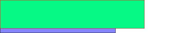
DIV.column1 {width: 45%;
height: 200px;
background: green;
border: red solid;
float: left}
DIV.column2 {width: 60%;
background: blue;
border: black solid;
height: 200px;
float: right;
block-overflow: float}
<DIV class="column1">
</DIV>
<DIV class="column2">
</DIV>
Would be rendered thus:
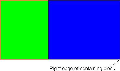
Note the float: right declaration. The right of the containing block (and hence the right of the right-floated element) is 100% of the way across the block, and thus floating to the right means that the left edge of the float is just over 40% across (i.e., 100% - 60% (width) - border width). However, since this would result in overlap with the previous column, the normal result would be to move the right-floated element down below the float. The effect of block-overflow: float is to waive this, thus causing overlap.
Compare that with:
DIV.column1 {width: 45%;
background: green;
border: red solid;
height: 200px;
float: left}
DIV.column2 {width: 60%;
background: blue;
border: black solid;
height: 200px;
float: left;
block-overflow: float}
Which would be rendered thus:
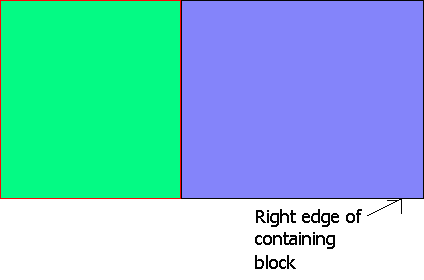
In this case, the normal result would be to place the left margin edge of column2 next to the right margin edge of any previous float, which is 45% of the way across the containing block. The right edge would be placed 45% + total width (60%) + border width = about 105% of the way across. Since 105% is greater than 100% (i.e., the width of the containing block), normally this would result in the element being moved down below the float, but block-overflow: float waives this, and the containing block is overflown.
These illustrate the general principles of floats:
DIV.float {border: solid red;
background: green;
float: left;
height: 100px;
width: 200px}
DIV.notfloating {border: solid black;
background: blue;
width: 400px;
line-height: 12px}
<DIV class="float">
</DIV>
<DIV class="notfloating">
Some text in the non-floating elemen that will wrap around the floating element. Notice how the line height is observed - the line spacing remains constant - the only thing that changes is the height of the line box.
</DIV>
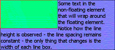
You can see in this example that subsequent block elements to a float do not take into account the position of that float, but inline content does take into account the float, being displaced by it. In addition, you can see that the block element's border is obscured by that of the float, since it is generally the rule that subsequent elements are drawn over previous ones. In addition, one thing is particularly noteworthy:
DIV.float {border: solid red;
float: left;
height: 100px;
width: 500px;}
DIV.notfloating {border: solid green;
width: 400px;
line-height: 12px;}
<DIV class="float">
</DIV>
<DIV class="notfloating">
Some text in the non-floating element.
</DIV>
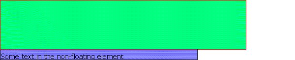
In this example, even though the previous float is wider than the block element, the line boxes still exist (but are 0 pixels wide and thus invisible), and hence the inline content (which is displaced by floats) starts in the tenth line box down (since the first line box that is not shortened to zero by the float is the tenth - 100 / 12 is 8.33; if part of a line box is overlapped, the whole must be - you cannot just reduce the line box height - thus meaning nine line boxes are shortened to zero by the float), which means that the float appears to have a 8 pixel margin-bottom.
DIV.float {border: solid red;
float: left;
height: 100px;
width: 400px;}
DIV.notfloating {border: solid green;
width: 400px;
overflow: hidden;
height: 115px;
line-height: 12px}
<DIV class="float">
</DIV>
<DIV class="notfloating">
Some text in the non-floating element.
</DIV>
In this example, since the non-floating element is not affected
by the floating element, it exactly overlaps with it. However,
since inline content is displaced by floats, and since
overflow is set to hidden (meaning that the
element cannot be increased in height to allow for the content),
there is nowhere for the inline content ('Some text in the
non-floating element') to be displaced to (since the line boxes
are rendered at 0-12px (0 pixels wide), 13-24px (0 pixels wide),
25-36px (0 pixels wide), 37-48px (0 pixels wide), 49-60px (0
pixels wide), 61-72px (0 pixels wide), 73-84px (0 pixels wide),
85-96px (0 pixels wide), and 97-108px (0 pixels wide - some of
the float overlaps to this level, and hence the whole line box is
reduced by the width of that float), with 109-115px effectively padding
(since the line box is 12px high, it requires from
109-120px)), and thus it cannot be rendered.
DIV.float1 {border: solid blue;
float: left;
width: 45%;
height: 200px}
DIV.nonfloat {border: solid red;
height: 100px;}
DIV.float2 {border: solid green;
width: 45%;
height: 300px;
float: left}
<DIV class="float1">
</DIV>
<DIV class="nonfloat">
</DIV>
<DIV class="float2">
</DIV>
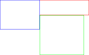
This example shows how floats take into the vertical position of previous block elements but not of previous floated elements, whose horizontal position only is taken into account.
In addition, it shows that a subsequent float continues in the vertical line that it was forced into by a float, even though that float might not be as high as it is.
DIV.float1 {border: solid red;
float: left;
width: 45%;
height: 200px}
DIV.nonfloat {border: solid blue;
height: 100px}
DIV.float2 {border: solid green;
width: 45%;
height: 300px;
float: right}
<DIV class="float1">
</DIV>
<DIV class="nonfloat">
</DIV>
<DIV class="float2">
</DIV>
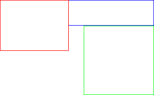
This example shows the difference between float:
left and float: right - with the previous
example, the 'spare' 10% (minus the space taken up by the
borders) of space was placed to the right of the second element,
but in this case it is placed between them, since one is aligned
with the left of the containing block and the other with its
right.
DIV.float1 {border: solid blue;
float: left;
width: 45%;
height: 200px}
DIV.nonfloat {border: solid red;
height: 100px;}
DIV.float2 {border: solid green;
width: 60%;
height: 300px;
float: left}
<DIV class="float1">
</DIV>
<DIV class="nonfloat">
</DIV>
<DIV class="float2">
</DIV>
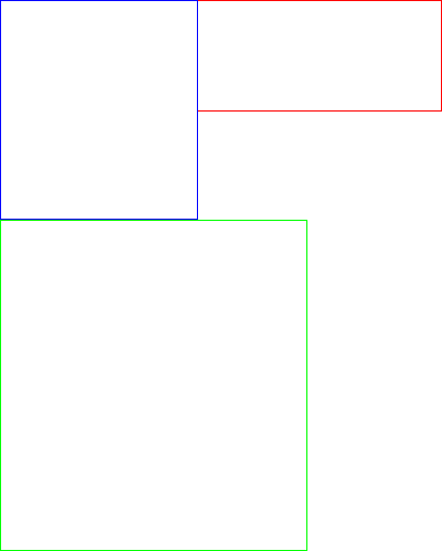
This example shows that where an element is so wide that it will
overflow its containing block, it is moved below any float (note
in this case that the result would have been the same given
float: right).
DIV.float {float: left;
background: blue;
height: 100px;
width: 400px}
DIV.container {width: 500px}
DIV.nonfloat {background: red;
height: 300px}
<DIV class="container">
<DIV class="float">
</DIV>
<DIV class="nonfloat">
</DIV>
</DIV>

In this example, the background of the non-floating element covers all of the area of the containing block, except for the 400px by 100px where the float (recall that floats are rendered in front of non-floating block elements) overlaps with it.
DIV {color: black;
background: white}
DIV.float {float: left;
height: 100px;
width: 400px}
IMG.nonfloat {width: 300px}
DIV.container {width: 600px}
<DIV class="container">
<DIV class="float">
</DIV>
<IMG class="nonfloat">
</DIV>
In this example, since there is not enough room for the replaced element, it is moved below the float, and hence the height of DIV.container is 400 pixels (300 pixels for the image, plus 100 pixels since it must start below the float).
When an element to be floated is initially inline, it is moved to the left or right until it hits either the outer edge of a previous float or the content edge of the containing block.
Thus, even though in
<P>
Some text <SPAN style="float: left">here</SPAN>
</P>
'here' occurs after 'Some text', the result would be:
hereSome text
Note that there is no space between the final 'e' of 'here' and the 'S' of 'Some'. This is because width: auto results in the element being given the width that its content requires. You should also note that all text on that line is re-flowed to compensate.
If the current line is not wide enough to fit the float as a result of an earlier float on that line (bear in mind that inline floats are moved to the left (or right) until they hit an earlier float or the content edge of the containing block), the element is moved down to the first float-free line. For example:
<P style="width: 200px; line-height: 20px;">
<IMG id="one" style="width: 100px; float: left; height:
105px"> <IMG style="width: 150px; float: left; height:
100px" id="two">Some textual content here
</P>
In this case image one would be floated as per normal. This would align its top with the top of the line box from which it was displaced.
Since it is 105 pixels high, and since each line box is 20 pixels
high (because of the line-height declaration), the
first 6 line boxes would be shortened by the width of the IMG,
and thus these six would be only 100 pixels wide instead of the
normal 200 pixels. It can be seen that even though the element
does not exactly cover the final line box, it is effectively
given a margin-bottom of 15 pixels, since you can't
shorten only part of a line box.
In addition, since image two is wider than the available space in the line box that the markup suggests, it must be moved down. Since inline floats must be aligned with the top of a line box, the float will be moved down to the first line box that is at least as wide as the float. In this case, that is the seventh line box, so the element is aligned with the top of the seventh line box, and since the element is 100px high, the seventh through eleventh line boxes (100px = 5 line boxes at 20px each), will be shortened by the width of the element, thus making them 50px wide.
However, since floats do not affect the dimensions of block elements except insofar as the re-flow of inline content is caused, the height of the P element would only be 140 or 160 pixels (depending on whether 'Some textual content here' took up one line or two), i.e., since 'Some textual content here' must follow image two, and since 'Some textual content here' is part of the block element (<P>), the height of the block must be that of the number of line boxes that 'Some textual content' takes up, plus the number of line boxes that must precede it.
If the markup were instead:
<P style="width: 200px; line-height: 20px;">
<IMG id="one" style="width: 100px; float: left; height:
105px"> <IMG style="width: 250px; float: left; height:
100px" id="two">Some textual content here
</P>
In this case image two will again be aligned with the top of the seventh line box, but in this case since the width of the containing block is 200 pixels, and since the maximum width of a line box is that of the containing block, each of line boxes 7-11 are 0 pixels wide, but still 20 pixels high. As a result, 'Some textual content here' (since it must follow image two) must appear on line box 12, and thus the height of the containing block is 240 pixels (= 20 * 12).
Consider instead:
<P style="width: 200px; line-height: 20px;">
<IMG id="one" style="width: 100px; float: left; height:
105px"> <IMG style="width: 250px; float: left; height:
100px" id="two">
</P>
The result here would be a 0 pixel high P element, since the height of a static block element without block-level children is from the top of the top line box to the bottom of the bottom non-empty line box [3], and thus its height is 0.
If inline non-replaced elements are floated, because they are inline blocks, their width is normally determined by the width of their content; however, if they are explicitly assigned a width this will not be so.
The effect of setting width on inline floats is thus:
<P style="width: 600px; overflow: hidden">
<SPAN style="width: 200px; float: left">A long line of text that would, with
display: block and width: 200px, have its
surplus content chopped off, or, with width: auto,
the overflow of the containing block.</SPAN>
</P>
Would result in something like this:
A long line of text that would,
with display: block and width:
200px, have its surplus content
chopped off, or, with width:
auto, the overflow of the
containing block.
These are the rules that define floats. They are the same in effect as CSS2's rules, but should be easier to implement. They define every element in terms of the edges of blocks.
Clear: none
Clear: left
Clear: right
Clear: both
Float: none
direction:
ltr
. The right margin edge is deduced from this (i.e.,
using width, margins, etc.).
direction: rtl, then the right margin edge of
these elements is aligned with the right content edge of the
containing block. The left margin edge is deduced from this (i.e.,
using width, margins, etc.).
Float: left
block-overflow is normal, then if
the float's right margin edge is to the right of the right inner
edge of the containing block and a float is 'current', or if the
float's right margin edge is to the right of the left margin edge
of any 'current' float, the element's top margin edge is
realigned as with the next block-level (i.e., including floated)
element following the one that it is currently aligned with, and
the process re-starts at step 1 [5].
block-overflow is set to float, then the element
is rendered where it is, causing overlap with other floats and/or
overflow of the containing block.
Float: right
block-overflow is normal, then if
the float's left margin edge is to the left of the left content edge
of the containing block and a float is 'current', or if the
float's left margin edge is to the left of the right margin edge of
any 'current' float, the element's top margin edge is realigned
as with the next block-level (i.e., including floated) element
following the one that it is currently aligned with, and the
process re-starts at step 1.
block-overflow is set to float, then the element
is rendered where it is, causing overlap with other floats and/or
overflow of the containing block.
Float: left/right
height, margin, border and
padding. If this does not result in the bottom of the float being
aligned with the bottom of a line box, margin-bottom is increased so
that this occurs.
float: none)
Float: left
display:
inline-block
; if not specified then equal to the content width), margins, borders and padding).
block-overflow is normal, then if
the float's right margin edge is to the right of the right inner
edge of the containing block and a float is 'current', or if the
float's right margin edge is to the right of the left margin edge
of any 'current' float, the element's top margin edge is
realigned as with the top of the first line box following the
one that it is currently aligned with, and the process re-starts
at step 1.
block-overflow is set to float, then
the element is rendered where it is, causing overlap with other
floats and/or overflow of the containing block.
Float: right
block-overflow is normal, then if
the float's left margin edge is to the left of the left content edge
of the containing block and a float is 'current', or if the
float's left margin edge is to the left of the right margin edge of
any 'current' float, the element's top margin edge is realigned
as with the top of the first line box following the one that it
is currently aligned with, and the process re-starts at step 1.
block-overflow is set to float, then
the element is rendered where it is, causing overlap with other
floats and/or overflow of the containing block.
float: none)
CSS should say for overflow: auto 'This should be
treated as overflow: visible, except on the root
element where with direction: ltr it is treated as
overflow: scroll on the root element's right inner
edge and overflow: hidden on its left content edge.
Where direction: rtl on the root element, it is
treated as overflow: visible on its left content edge,
and overflow: hidden on its right content edge.' [8, 9]
This is to cater for the situation where an element overflows the left edge of the containing block (e.g., float: right; width: 105%).
This applies to the content of inline-block elements and to table cell elements.
block-overflow is used instead
of overflow because of backward-compatibility issues (e.g.,
overflow: float scroll might be wanted, but should break old
implementations).
clear: left. My approach is
necessary, since the line boxes are still needed for alignment
purposes, but will only be allocated if inline content follows an
inline float.
left,
right, etc.
width of the containing
block.
Copyright © RichInStyle.com 2000; all rights reserved. See copyright document for terms of use. Please visit Bukit Lawang flood appeal.